National Safety Code Knowledge Test
Rapid UX/UI design of online test for NSC
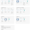
Client: Ministry of Transportation and Infrastructure, National Safety Code Branch
Project duration: 3 months
Tools: Paper, Pencil, Jira, Azure, Adobe XD
UX techniques used: User Research, Mind Mapping, Wireframing, and Rapid Prototyping.
My Role
I was the only UX Designer on this portion of the project designed everything. I worked closely with the Business Analyst to gather requirements.
Primary Business Goals
The KT online is available to all NSC certificate applicants as fast as possible. They couldn’t process any application until the test was live on the VehicleSafetyBc Portal.
Definition of Primary Needs
- The need to improve the navigation to simplify access to the questions and the other actions include canceling the test/skipping a question.
- The need for a countdown timer would enable the users to keep time while doing the test.
- The need to make the questions clear and ensure that they are presented attractively (some with images, all of them with a choice of 5-6 possible answers).
- The need to have a startup page and a results page.
Problem Statement
The Knowledge test was always done at ICBC booths. Covid-19 led to the closure of the booths making it hard for people to do the tests. There was no way for carriers to do the test! The NSC team then gave us the task of making the test available online on the new VehicleSafetyBC Portal.
Our main goal was to make the test extremely intuitive to all the users. A good number of the people who must take the test are not tech-savvy, and some have very limited English language knowledge.
The Process
Design: 1 feature at the time
We followed the same design principles already established on the Portal:
Headers, spacing, radio buttons (designed to have a large clickable area).
I wanted the user to focus on one question at a time to show only one question per page.


We have been using small left-hand navigation in many apps developed. We retained the strategy in the current project to make sure that the clients can use the platform with ease. The style could make navigation easier for the users.
We needed the question navigation to indicate:
- The total number of questions
- The current question
- How many questions had been answered
- And to allow the user to jump to any question
I made sure that the navigation had a small square button for each forty-five question (9 rows of 5). The current question will be highlighted in yellow. The questions that have been answered would be greyed out. The unanswered questions were marked in white. The users would then navigate to a question by clicking on the button for the particular question.
Below each question, I made a button for selecting the answer, then a link to save the answer and go to the next question or skip the question. Once the user has answered the question to pass the test (36/45 or 80%), they see a submit button allowing them to finish the test, if desired. But, if a user submits the test with some unanswered questions, they will see a message reminding them that they can go back and complete all questions for a better chance of passing the test.
At first, I had added a button to cancel the test to the design. Our testers found it too easy to click by the button by mistake and found it too “important” on the page. We changed it to a more subtle link.


Countdown Timer
We also needed a countdown timer. Users have 45 minutes to finish the test, and we wanted them to easily tell how much time they have left to complete the test. We wanted something clear but not too obtrusive and potentially more stressful.
We asked our test users for their preference between a few different designs. We placed the timer above the navigation. The timer background turns yellow when there are 5 minutes left to hint that there is not too much time left to complete the test.
Information Pages
We added a start page with detailed instructions so the user would know what to expect before starting the test, including a clear navigation description.
Last, we designed a simple result page, including instructions on the next step.
Conclusion
The NSC Knowledge test was pushed live in September 2020, 3 months after we started to work on it.
The NSC team gathered some comments from some of the early users, and all said the test was easy to navigate and well-designed. All commented in the details that make it “fool-proof.” The NSC Manages were thrilled to see the project completed successfully. The test blueprint was requested to be used as the basis for two similar tests within the Government.